
Lage Check
Website Design
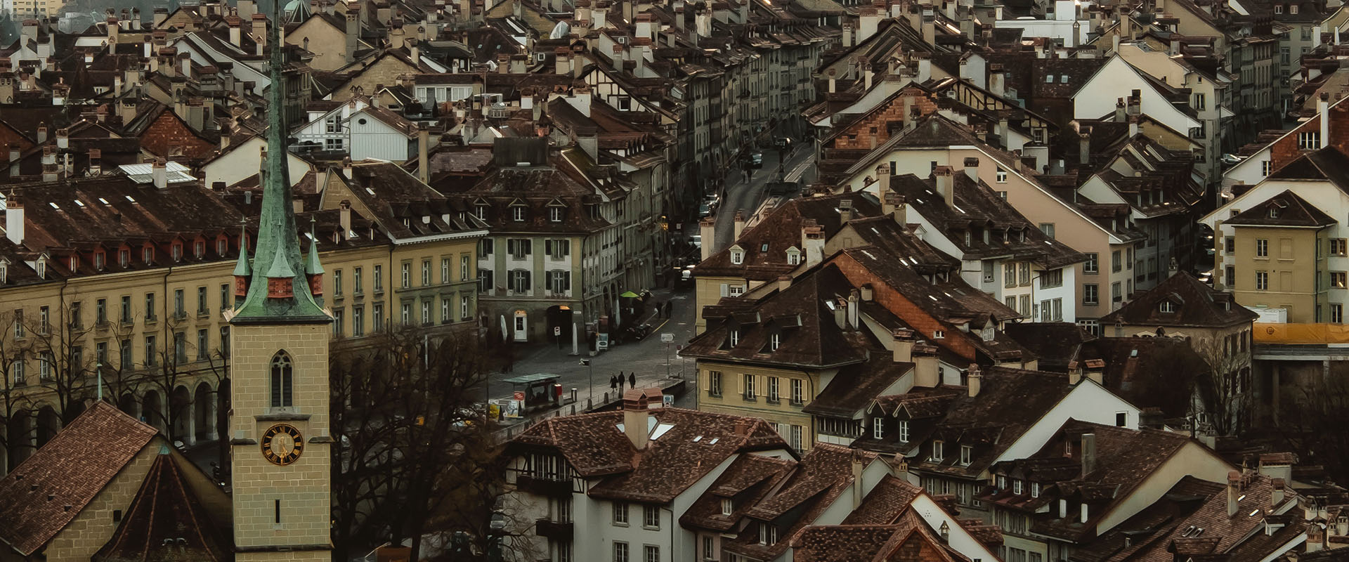
Basler Kantonalbank’s “Lage-Check” is a modern location information website (similar to a real estate website) for the Switzerland market. It has in-depth neighborhood and city guides to help users decide the best location, and a variety of in-depth filters (such as mode of transport availability and restaurant ratings) to go through the available listings.
- Responsibilities
- Map flow | Prototype | Visual design
- Role
- UX-UI Designer
- Type
- Company (LetsApp & IMMO Info. Tech.)
- Year
- February 2018
Getting Started
As usual, I began doing groundwork on the foundation. My initial set of goals were to:
- Understanding the current state of the Switzerland real estate market
- Run a competitive analysis with the best real estate and property information websites in the world
- Understand the business strategy, the core goals and what the client was trying to accomplish
- Understand the target audience and get a good grasp of who I was designing for their needs, behaviors, and frustrations when finding a place to live
After speaking with the client and running base research and understanding how the municipality and the councils work in Switzerland, I created a few personas that summarized the user's Lage Check would focus on.


Functionality Maps
I then moved to thinking about the most efficient ways of enabling users to accomplish major tasks, such as finding information on a specific location or listing detailed information of each section. I used functionality maps — a tool I love and recommend — to visualize how the web app would flow out.

Wireframing
I moved then to wireframes and started thinking about how the interface would actually work. This was an extensive wireframing exercise. A lot of smaller, essential details, needed to be taken care of, and since I was on a tight deadline, I took the time that was necessary to deliver really solid wireframes.
I had to show a map and detailed view, for this I had to divide the page accordingly. Where the main focus had to be on the map view, as its where the user would interact more. For this, I divided the half based on the golden ratio. I have included a few of them below:


Mockups
The wireframes provided set a foundation of the core UI elements. And once the clients were happy with the wireframes, it was time to move on to higher-fidelity representations and incorporate the brand and visual elements.
I’ll list some of the essential mockups below — you’ll see, how the homepage turned out, as well as the location detail pages.


Wrapping Up
After finalizing the platform mockups, I spent some time with the team playing around with experiments for upcoming functionality. We experimented with the sunshine of that location, nearby properties listing and more. The idea was to visualize how they might look and feel. If the client decides in the future to fully built these.
I was extremely happy with the end result — it was absolutely spot on. Working with one the largest banks in Switzerland was phenomenal and the project was challenging but really fun too. Basler Kantonalbank’s “Lage-Check” should launch at some point in the next two quarters.